OVERVIEW
Looking for a job is not fun and can be very time consuming if you are dealing with different career portals. They’re all looking for the same results; however, the difference is how they collect the candidate’s information.
Client: iHawk Career
Sector: Human Resources
Services:
+ User Research
+ Wireframes
+ Concept
+ UI Design
+ User-Centred Design
+ User Testing
In the past couple of years, I’ve been getting feedback from friends and family members about poor experience when they were looking for a job online. Lately I decided to put it to the test and started my journey to look for a new career.
I started out using a few popular websites and soon enough I was getting discouraged. So, I decided to create a dynamic user dashboard for all job hunters out there. It’s called “iHawk Career.”

USER RESEARCH
To start, I prepared a simple questionnaire based on my findings and past feedback. I reached out to 16 people to interview and talk about their challenges when they were looking for a job.
Persona Development
Research Findings
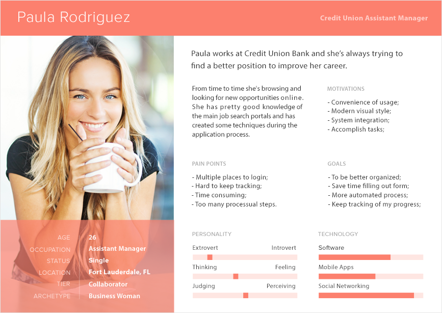
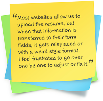
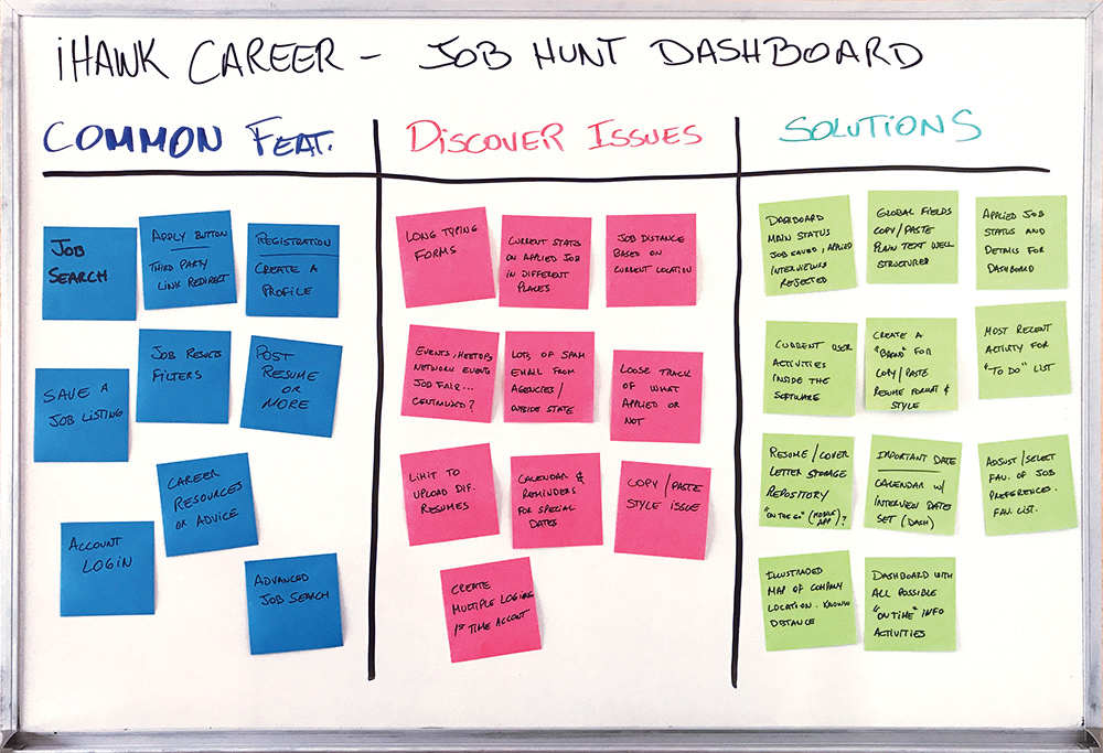
Based on their responses, I was able to create my Persona, and gathered some issues and recommendations to improve the user experience.
TASK ANALYSIS
Now I was able to come up with a few deliverable solutions and at the same time renovate existing features.
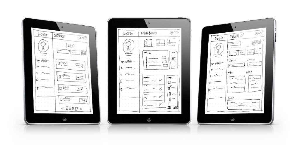
SKETCH
I don’t start any project without sketching first. I spend a long time drawing on the paper or on my iPad whenever I’m on the road and a new idea comes up.
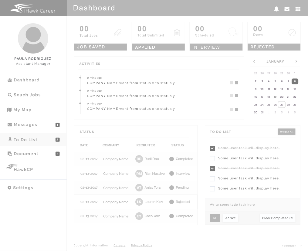
WIREFRAME
After whiteboarding and throwing away a bunch of approaches, I moved onto making high fidelity wireframes.
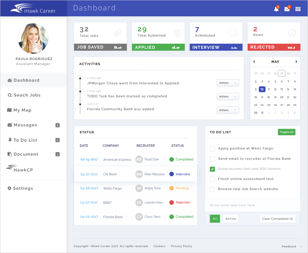
PROTOTYPE
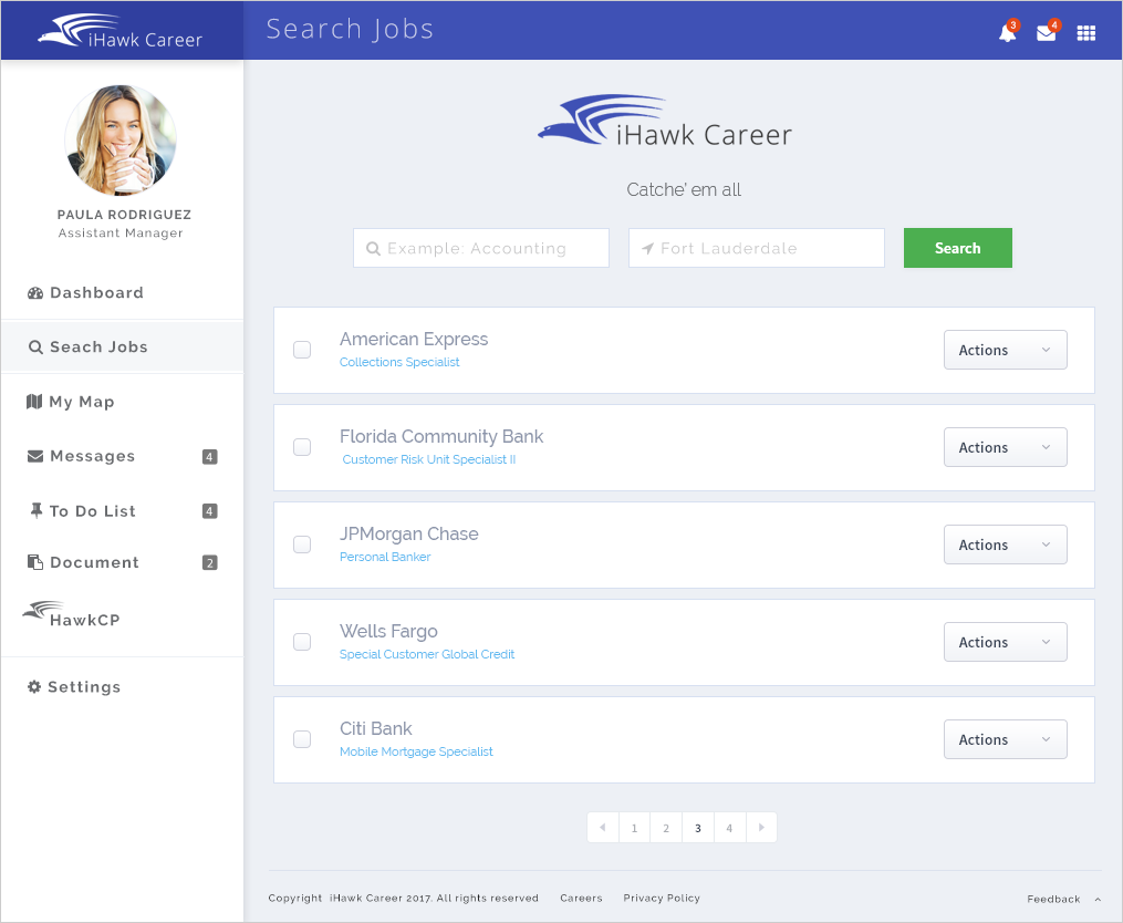
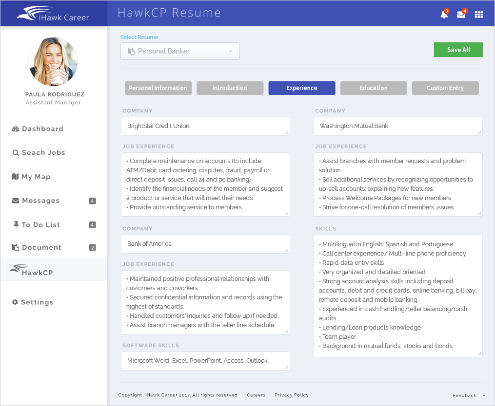
Here we have a few screens of some important features and improvements.
When applying for jobs there are times that you need to copy and paste information from your resume to a specific form on the recruiter’s website.
During this process you will bring the current style you have set on your source (ex. bullet points, special characters, tab spacing, and more) and when you paste to a form field, it will re-format to a plain text. This will cause some style to look funky and users will have to revise, retype and adjust the format. This is a very time consuming task and that’s why I came up with this feature called “HawkCP“.
After uploading a resume, HawkCP will extract all contents and group them accordingly into a field category. It will also allow users to create custom fields and place their own answers (Ex. Reasons for leaving current job, Languages, work-related references, explanation for any lapse of employment).
USABILITY TESTING
Participants will perform tasks and information will be collected to identify problems or issues with the interface and why these issues arise. The goal here is to make sure the client utilization of a product meets the desired user experience.

